Hello stranger, and welcome! 👋😊
I'm Rasmus Bååth, data scientist, engineering manager, father, husband, tinkerer,
tweaker, coffee brewer, tea steeper, and, occasionally, publisher of stuff I find
interesting down below👇
Why would Bayesian statistics need a mascot/symbol/logo? Well, why not? I don’t know of any other branch of statistics that has a mascot but many programming languages have.
R has an “R”,
Python has a python snake, and
Go has an adorable little gopher. While Bayesian statistics isn’t a programming language it could be characterized as a technique/philosophy/framework with an active community and as such it wouldn’t be completely off if it had a mascot.
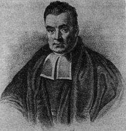
However, it does not matter if you think it would be silly if Bayesian statistics had a mascot. There is already a mascot and he is not a particularly good one. Meet Mr Bayes:
So R is awesome. Felt good to get that out of the way! But sometimes I long for some small syntax additions while programming away in R in the night…

The picture is of a restaurant called Risotto in Berlin.
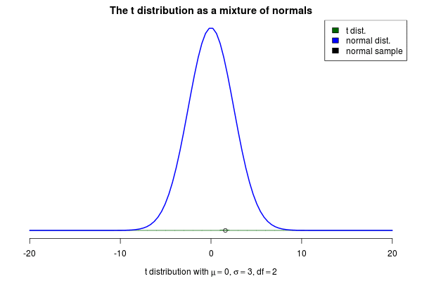
You’ve probably heard about the t distribution. One good use for this distribution is as an alternative to the normal distribution that is more robust against outliers. But where does the t distribution come from? One intuitive characterization of the t is as
a mixture of normal distributions. More specifically, as a mixture of an infinite number of normal distributions with a common mean $\mu$ but with precisions (the inverse of the variance) that are randomly distributed according to
a gamma distribution. If you have a hard time picturing an infinite number of normal distributions you could also think of a t distribution as a normal distribution with a standard deviation that “jumps around”.
Using this characterization of the t distribution we could generate random samples $y$ from a t distribution with a mean $\mu$, a scale $s$ and a degrees of freedom $\nu$ as:
$$y \sim \text{Normal}(\mu, \sigma) $$
$$ 1/\sigma^2 \sim \text{Gamma}(\text{shape}= \nu / 2, \text{rate} = s^2 \cdot \nu / 2)$$
This brings me to the actual purpose of this post, to show off a nifty visualization of how the t can be seen as a mixture of normals. The animation below was created by drawing 6000 samples of $1/\sigma^2$ from a $\text{Gamma}(\text{shape}= 2 / 2, \text{rate} = 3^2 \cdot 2 / 2)$ distribution and using these to construct 6000 normal distribution with $\mu=0$. Drawing a sample from each of these distributions should then be the same as sampling from a $\text{t}(\mu=0,s=3,\nu=2)$ distribution. But is it? Look for yourself:
In the
last post I showed how to use Laplace approximation to quickly (but dirtily) approximate the posterior distribution of a Bayesian model coded in R. This is just a short follow up where I show how to use
importance sampling as an easy method to shape up the Laplace approximation in order to approximate the true posterior much better. But first, what is importance sampling?
Importance Sampling
Importance sampling is a method that can be used to estimate the integral of a function even though we only have access to the density of that function at any given point. Using a further resampling step, this method can be used to produce samples that are (approximately) distributed according to the density of the given function. In Bayesian statistics this is what we often want to do with a function that describes the density of the posterior distribution. In the case when there is more than one free parameter the posterior will be multidimensional and there is nothing stopping importance sampling from working in many dimensions. Below I will only visualize the one dimensional case, however.
The first step in the importance sampling scheme is to define a proposal distribution that we believe covers most of our target distribution, the distribution that we actually want to estimate. Ideally we would want to choose a proposal distribution that is the same as the target distribution, but if actually could do this we would already be able to sample from the target distribution and importance sampling would be unnecessary. Instead we can make an educated guess. A sloppy guess is to use a uniform proposal distribution that we believe covers most of the density of the target distribution. For example, assuming the target distribution has most of its density in $[-4,4]$ we could setup the importance sampling as:
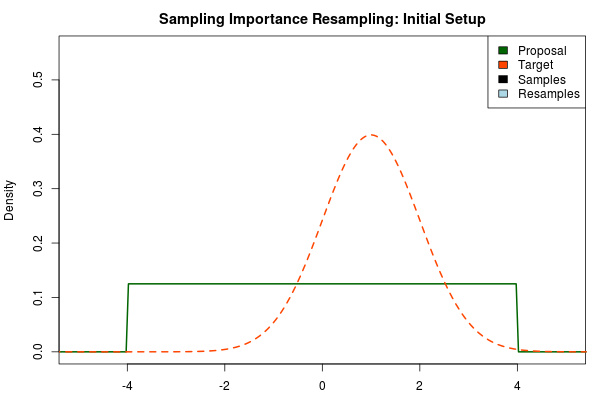
Here, the target distribution is actually a $\text{Normal}(\mu=1,\sigma=1)$ distribution, but most often we do not know its shape.
Thank you for tuning in! In this post, a continuation of
Three Ways to Run Bayesian Models in R, I will:
- Handwave an explanation of the Laplace Approximation, a fast and (hopefully not too) dirty method to approximate the posterior of a Bayesian model.
- Show that it is super easy to do Laplace approximation in R, basically four lines of code.
- Put together a small function that makes it even easier, if you just want this, scroll down to the bottom of the post.
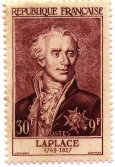
But first a picture of
the man himself:
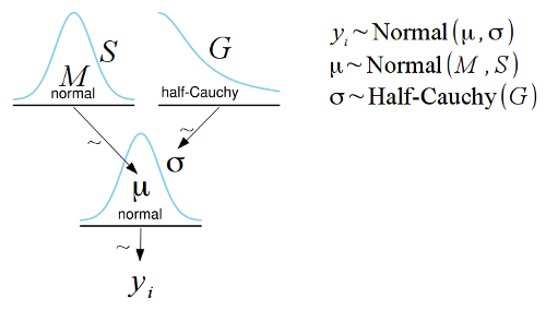
I argued
recently that a good way of communicating statistical models graphically was by using the convention devised by John K. Kruschke in his book
Doing Bayesian Data Analysis. John Kruschke describes these diagrams in more detail on his blog:
here,
here and
here. While I believe these kinds of diagrams are great in many ways there is a problem in that they are quite tricky to make. That is, until now!
I have put together a template for the free and open source
LibreOffice Draw which makes it simple to construct Kruschke style diagrams such as the one below:
I’m often irritated by that when a statistical method is explained, such as linear regression, it is often characterized by how it can be calculated rather than by what model is assumed and fitted. A typical example of this is that linear regression is often described as a method that uses
ordinary least squares to calculate the best fitting line to some data (for example, see
here,
here and
here).
From my perspective ordinary least squares is better seen as the computational method used to fit a linear model, assuming normally distributed residuals, rather than being what you actually do when fitting a linear regression. That is, ordinary least squares is one of many computational methods, such as gradient descent or simulated annealing, used to find the maximum likelihood estimates of linear models with normal residuals. By characterizing linear regression as a calculation to minimize the squared errors you hide the fact that linear regression actually assumes a model that is simple and easy to understand. I wish it was more common to write out the full probability model that is assumed when describing a statistical procedure as it would make it easier to quickly grasp the assumptions of the procedure and facilitate comparison between different procedures.
But how to write out the full probability model? In this post I’m going to show two different textual conventions and two different graphical conventions for communicating probability models. (Warning, personal opinions ahead!)
In the
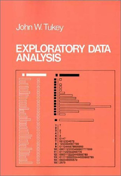
last post I described flogs, a useful transform on proportions data introduced by
John Tukey in his
Exploratory Data Analysis. Flogging a proportion (such as, two out of three computers were Macs) consisted of two steps: first we “started” the proportion by adding 1/6 to each of the counts and then we “folded” it using what was basically a rescaled log odds transform. So for the proportion two out of three computers were Macs we would first add 1/6 to both the Mac and non-Mac counts resulting in the “started” proportion (2 + 1/6) / (2 + 1/6 + 1 + 1/6) = 0.65. Then we would take this proportion and transform it to the log odds scale.
The last log odds transform is fine, I’ll buy that, but what are we really doing when we are “starting” the proportions? And why start them by the “magic” number 1/6? Maybe John Tukey has the answer? From page 496 in Tukey’s EDA:
The desirability of treating “none seen below” as something other than zero is less clear, but also important. Here practice has varied, and a number of different usages exist, some with excuses for being and others without. The one we recommend does have an excuse but since this excuse (i) is indirect and (ii) involves more sophisticated considerations, we shall say no more about it. What we recommend is adding 1/6 to all […] counts, thus “starting” them.
Not particularly helpful… I don’t know what John Tukey’s original reason was (If you know, please tell me in the comments bellow!) but yesterday I figured out a reason that I’m happy with. Turns out that starting proportions by adding 1/6 to the counts is an approximation to the median of the posterior probability of the $\theta$ parameter of a
Bernouli distribution when using Jeffrey’s prior on $\theta$. I’ll show you in a minute why this is the case but first I just want to point out that intuitively this is roughly what we would want to get when “starting” proportions.
Fractions and proportions can be difficult to plot nicely for a number of reasons:
- If the proportions are based on small counts (e.g., two of his three computing devices were Apple products) then the calculated proportions will only take on a number of discrete values.
- Depending on what you have measured there might be many proportions close to the 0 % and 100 % edges of the scale (Five of his five computing devices were non-Apple products).
- There is no difference made between a proportion that is the result of few counts (33 %, one out of three, were Apple products) and large counts (33 %, three out of nine, were Apple products).
Especially irritating is that the first two of these problems results in overplotting that makes it hard to see what is going on in the data. So how to plot proportions without running into these problems? John Tukey to the rescue!
Just came home from the
14th Rhythm Perception and Production Workshop, this time taking place at the University of Birmingham, UK. Like the last time in Leipzig there were lots of great talks and much food for thought. Some highlights, from my personal perspective:
- Bayesian perception of isochronous rhythms presented by
Darren Rhodes and Massimiliano Di Luca. Interesting idea and nice to see a fellow Bayesian.
- Slowness in music performance and perception: An analysis of timing in Feldman’s “Last Pieces” presented by
Dirk Moelants. Fun talk that dealt with how “slow” was interpred by performers of Feldman’s “Last Pieces”. Here is a not too slow rendition of some
“Last Pieces” on youtube.
- Parameter estimation of sensorimotor synchronization models presented by
Nori Jacoby, Peter Keller and Bruno Repp. Technical and interesting talk and I believe they have some papers out on this already.
- Two interesting talk on resonance models and EEG: Scrutinizing subjective rhythmization: A combined ERP/oscillatory approach by
Christian Obermeier and Sonja A. Kotz, and From Sounds to Movement and Back: How Movement Shapes Neural Representation of Beat and Meter presented by
Sylvie Nozaradan, Isabelle Peretz, André Mouraux