Fractions and proportions can be difficult to plot nicely for a number of reasons:
- If the proportions are based on small counts (e.g., two of his three computing devices were Apple products) then the calculated proportions will only take on a number of discrete values.
- Depending on what you have measured there might be many proportions close to the 0 % and 100 % edges of the scale (Five of his five computing devices were non-Apple products).
- There is no difference made between a proportion that is the result of few counts (33 %, one out of three, were Apple products) and large counts (33 %, three out of nine, were Apple products).
Especially irritating is that the first two of these problems results in overplotting that makes it hard to see what is going on in the data. So how to plot proportions without running into these problems? John Tukey to the rescue!

In his famous Exploratory Data Analysis Tukey explains a transform of proportions he calles folded logs, or flogs for short, designed to alleviate the problems with plotting proportions described above. And since I found the flog transform really neat (but didn’t find any good description online) I though I would describe it here!
First lets look at some (unfortunately made up) data that exhibits all the problems outlined above. Say that you are hired by Apple’s marketing department to investigate whether a person’s income influences the proportion of Apple produced computing devices (phones, computers, etc) that person has. So you ask a number of persons how many computing devices they have, how many of them are Apple devices and how much they earn. The resulting data could look something like this:
head(d)
##   no_of_devices no_of_apple_devices income
## 1             1                   0  72000
## 2             3                   3 106000
## 3             3                   3  59000
## 4             3                   1  48000
## 5             4                   3  60000
## 6             3                   3  92000
And if we directly plotted the income against the proportion of Apple devices it would look like this:
plot(d$income, d$no_of_apple_devices/d$no_of_devices, xlab = "Income", ylab = "Proportion of Apple devices")

As you can see this plot exhibits overplotting at the “edges”, 0 % and 100 % , and at the 50 % mark. Now flogging involves two steps, one step that solves the problem that we are treating $2/3$ and $3/9$ as the same proportion and a second step that addresses the overplotting at the edges.
The first step is adding 1/3 to all counts before calculating the proportions. Why? From page 496 in Tukey’s EDA:
The desirability of treating “none seen below” as something other than zero is less clear, but also important. Here practice has varied, and a number of different usages exist, some with excuses for being and others without. The one we recommend does have an excuse but since this excuse (i) is indirect and (ii) involves more sophisticated considerations, we shall say no more about it. What we recommend is adding 1/6 to all […] counts, thus “starting” them.
This makes sense intuitively, if a person has five out of five (that is $5/5 =100%$) Apple products we should be much more certain that she is an Apple fangirl than if a person has one out of one Apple products ($1/1$, also 100%). This intuition is implemented by starting the counts as Tukey proposes:
start_proportion <- function(successes, failures) {
    successes <- successes + 1/6
    failures <- failures + 1/6
    successes/(successes + failures)
}
The Apple fangirl will get an adjusted, “started”, proportion of $(5 + 1/6) / (5 + 1/3) = 97 %$ while the one device guy will get a downgraded proportion of $(1 + 1/6) / (1 + 1/3) = 88 %$. Plotted, these started values look like:
plot(d$income, start_proportion(d$no_of_apple_devices, d$no_of_devices - d$no_of_apple_devices),
    xlab = "Income", ylab = "Proportion of Apple devices")

Now to alleviate the overplotting at the edges we are going to transform the proportions from the range $[0 %,100 %]$ to the range $[-\infty , \infty]$ by the transformation
$$flog = 1/2 \cdot log(p) - 1/2 \cdot log(1 -p)$$
which when plotted looks like
p <- seq(0, 1, 0.01)
plot(p, 1/2 * log(p) - 1/2 * log(1 - p), type = "l", ylab = "flog")
abline(a = -1, b = 2, lty = 2, col = "red")
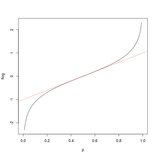
You might recognize this as a rescaled logit transform. The reason for the rescaling is that it eases the interpretation of the resulting flogs where flogs from -0.5 to 0.5 almost linear maps onto 25% - 75%. Flogging the already “started” proportions result in the following plot:

Compare this plot with the plot of the raw proportions at the top of the post. In this last plot there isn’t as much overplotting and we more clearly see the relation between income and the proportion of Apple devices. Flogs are a great tool to have in your exploratory data analysis toolbox and the following code snippet defines a useful flog function that accepts either the number of successes and failures or the number of successes and the total count as input:
flog <- function(successes, failures, total_count = successes + failures) {
    p <- (successes + 1/6)/(total_count + 1/3)
    (1/2 * log(p) - 1/2 * log(1 - p))
}