You’ve probably heard about the t distribution. One good use for this distribution is as an alternative to the normal distribution that is more robust against outliers. But where does the t distribution come from? One intuitive characterization of the t is as a mixture of normal distributions. More specifically, as a mixture of an infinite number of normal distributions with a common mean $\mu$ but with precisions (the inverse of the variance) that are randomly distributed according to a gamma distribution. If you have a hard time picturing an infinite number of normal distributions you could also think of a t distribution as a normal distribution with a standard deviation that “jumps around”.
Using this characterization of the t distribution we could generate random samples $y$ from a t distribution with a mean $\mu$, a scale $s$ and a degrees of freedom $\nu$ as:
$$y \sim \text{Normal}(\mu, \sigma) $$
$$ 1/\sigma^2 \sim \text{Gamma}(\text{shape}= \nu / 2, \text{rate} = s^2 \cdot \nu / 2)$$
This brings me to the actual purpose of this post, to show off a nifty visualization of how the t can be seen as a mixture of normals. The animation below was created by drawing 6000 samples of $1/\sigma^2$ from a $\text{Gamma}(\text{shape}= 2 / 2, \text{rate} = 3^2 \cdot 2 / 2)$ distribution and using these to construct 6000 normal distribution with $\mu=0$. Drawing a sample from each of these distributions should then be the same as sampling from a $\text{t}(\mu=0,s=3,\nu=2)$ distribution. But is it? Look for yourself:
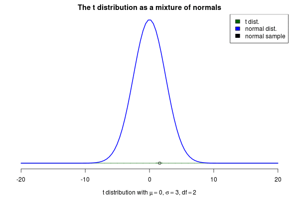
Indeed it converges to a t distribution! The degrees of freedom parameter $\nu$ decides how variable the SDs of the normals will be, where a high $\nu$ means less variable SDs. If we increase $\nu$ to 10 we still see that the SDs of the normals “jumps around”, but not as much as before:

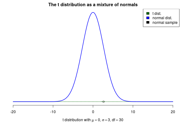
As $\nu$ increases even further the normals will start becoming more and more similar, thus the t distribution starts looking more and more like a normal distribution. Here is an animation with $\nu=30$ where the resulting distribution looks almost normal.