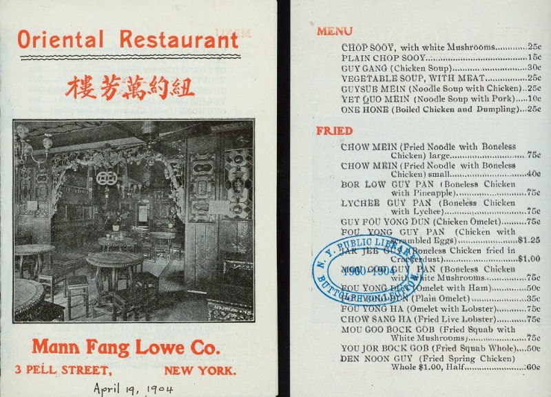
I just found a fun food themed dataset that I’d never heard about and that I thought I’d share. It’s from a project called What’s on the menu where the New York Public Library has crowdsourced a digitization of their collection of historical restaurant menus. The collection stretches all the way back to the 19th century and well into the 1990’s, and on the home page it is stated that there are “1,332,271 dishes transcribed from 17,545 menus”. Here is one of those menus, from a turn of the (old) century Chinese-American restaurant:
The data is freely available in csv format (yay!) and here I ’ll just show how to the get the data into R and I’ll use it to plot the popularity of some foods over time.
First we’re going to download the data, “unzip” csv files into a temporary directory, and read them into R.
library(tidyverse)
library(stringr)
library(curl)

# This url changes every month, check what's the latest at https://menus.nypl.org/data
menu_data_url <- "https://s3.amazonaws.com/menusdata.nypl.org/gzips/2016_09_16_07_00_30_data.tgz"
temp_dir <- tempdir()
curl_download(menu_data_url, file.path(temp_dir, "menu_data.tgz"))
untar(file.path(temp_dir, "menu_data.tgz"), exdir = temp_dir)
dish <- read_csv(file.path(temp_dir, "Dish.csv"))
menu <- read_csv(file.path(temp_dir, "Menu.csv"))
menu_item <- read_csv(file.path(temp_dir, "MenuItem.csv"))
menu_page <- read_csv(file.path(temp_dir, "MenuPage.csv"))
The resulting tables together describe the contents of the menus, but in order to know which dish was on which menu we need to join together the four tables. While doing this we’re also going to remove some uninteresting columns and remove some records that were not coded correctly.
d <- menu_item %>% select( id, menu_page_id, dish_id, price) %>%
  left_join(dish %>% select(id, name) %>% rename(dish_name = name),
            by = c("dish_id" = "id")) %>%
  left_join(menu_page %>% select(id, menu_id),
            by = c("menu_page_id" = "id")) %>%
  left_join(menu %>% select(id, date, place, location),
            by = c("menu_id" = "id")) %>%
  mutate(year = lubridate::year(date)) %>%
  filter(!is.na(year)) %>%
  filter(year > 1800 & year <= 2016) %>%
  select(year, location, menu_id, dish_name, price, place)
What we are left with in the d data frame is a table of what dishes were served, where they were served and when. Here is a sampler:
d[sample(1:nrow(d), 10), ]
# A tibble: 10 × 6
    year                      location menu_id                         dish_name price
   <dbl>                         <chr>   <int>                             <chr> <dbl>
1   1900            Fifth Avenue Hotel   25394            Broiled Mutton Kidneys    NA
2   1971                 Tadlich Grill   26670                       Mixed Green  0.85
3   1939                Maison Prunier   30325                  Entrecote Minute    NA
4   1914          The Beekman Café Co.   33898                  Camembert cheese  0.10
5   1900         Carlton Hotel Company   21865                        Pork Chops  0.15
6   1914 Gutmann's Café and Restaurant   33982 Cold Boiled Ham with Potato Salad  0.40
7   1912               Waldorf-Astoria   34512            Stuffed Figs and Dates  0.30
8   1933                   Hotel Astor   31262              Assorted Small Cakes  0.25
9   1933              Ambassador Grill   31291                    Stuffed celery  0.55
10  1901            Del Coronado Hotel   14512                           peaches    NA
# ... with 1 more variables: place <chr>
Personally I’d go for the Stuffed Figs and Dates at the Waldorf-Astoria followed by some Assorted Small Cakes 21 years later at the Astor. If you want to download this slightly processed version of the dataset it’s available here in csv format. We can also see which are the most common menu items in the dataset:
d %>% count(tolower(dish_name)) %>% arrange(desc(n)) %>% head(10)
# A tibble: 10 × 2
   `tolower(dish_name)`     n
                  <chr> <int>
1                coffee  8532
2                celery  4865
3                olives  4737
4                   tea  4682
5              radishes  3426
6       mashed potatoes  2999
7       boiled potatoes  2502
8     vanilla ice cream  2379
9         chicken salad  2306
10                 milk  2218
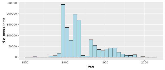
That coffee is king isn’t that surprising, but the popularity of celery seems weird. My current hypothesis is that “celery” often refers to some kind of celery salad, or maybe it was common as a snack in the New York area in the 1900s. It should be remembered that the dataset does not represent what people ate in general, but is based on what menus were collected by the New York public library (presumably from the New York area). Also the bulk of the menus are from between 1900 and 1980:
ggplot(d, aes(year)) +
  geom_histogram(binwidth = 5, center = 1902.5, color = "black", fill = "lightblue") +
  scale_y_continuous("N.o. menu items")
Even though it’s not completely clear what the dataset represents we could still have a look at some food trends over time. Below I’m going to go through a couple of common foodstuffs and, for each decennium, calculate what proportion of menus includes that foodstuff.
d$decennium = floor(d$year / 10) * 10
foods <- c("coffee", "tea", "pancake", "ice cream", "french frie",
           "french peas", "apple", "banana", "strawberry")
# Above I dropped the "d" in French fries in order to also match
#"French fried potatoes." Also, thanks to @patternproject, I added \\b
# in front of the regexp below which requires the food words to start with
# a word boundary, removing the situation where tea matches to, e.g., steak.
food_over_time <- map_df(foods, function(food) {
  d %>%
    filter(year >= 1900 & year <= 1980) %>%
    group_by(decennium, menu_id) %>%
    summarise(contains_food =
      any(str_detect(dish_name, regex(paste0("\\b", food), ignore_case = TRUE)),
          na.rm = TRUE)) %>%
    summarise(prop_food = mean(contains_food, na.rm = TRUE)) %>%
    mutate(food = food)
})
First up, Coffee vs. Tea:
# A reusable list of ggplot2 directives to produce a lineplot
food_time_plot <- list(
  geom_line(),
  geom_point(),
  scale_y_continuous("% of menus include",labels = scales::percent,
                     limits = c(0, NA)),
  scale_x_continuous(""),
  facet_wrap(~ food),
  theme_minimal(),
  theme(legend.position = "none"))

food_over_time %>% filter(food %in% c("coffee", "tea")) %>%
  ggplot(aes(decennium, prop_food, color = food)) + food_time_plot

Both pretty popular menu items, but I’m not sure what to make of the trends… Next up Ice cream vs. Pancakes:
food_over_time %>% filter(food %in% c("pancake", "ice cream")) %>%
  ggplot(aes(decennium, prop_food, color = food)) + food_time_plot

Ice cream wins, but again I’m not sure what to make of how ice cream varies over time. Maybe it’s just an artifact of how the data was collected or maybe it actually reflects the icegeist somehow. What about French fries vs. French peas:
food_over_time %>% filter(food %in% c("french frie", "french peas")) %>%
  ggplot(aes(decennium, prop_food, color = food)) + food_time_plot

Seems like the heyday of French peas are over, but French fries also seemed to peak in the 40s… Finally let’s look at some fruit:
food_over_time %>% filter(food %in% c("apple", "banana", "strawberry")) %>%
  ggplot(aes(decennium, prop_food, color = food)) + food_time_plot

Banana has really dropped in menu popularity since the early 1900s…
Anyway, this is a really cool dataset and I barely scratched the surface of what could be done with it. If you decide to explore this dataset further, and you make some plots and/or analyses, do send me a link and I will link to it here.
To finish off let’s look at this elegant cocktail menu from 1937 which, among cocktails and fizzes, advertises tiny cocktail tamales:
