After having broken the Bayesian eggs and prepared your model in your statistical kitchen the main dish is the posterior. The posterior is the posterior is the posterior, given the model and the data it contains all the information you need and anything else will be a little bit less nourishing. However, taking in the posterior in one gulp can be a bit difficult, in all but the most simple cases it will be multidimensional and difficult to plot. But even if it is one-dimensional and you could plot it (as, say, a density plot) that does not necessary mean that it is easy to see what’s going on.
One way of getting around this is to take a bite at a time and look at summaries of the marginal posteriors of the variables of interest, the two most common type of summaries being point estimates and credible intervals (an interval that covers a certain percentage of the probability distribution). Here one is faced with a choice, which of the many ways of constructing point estimates and credible intervals to choose? This is a perfectly good question that can be given an unhelpful answer (with a predictable follow-up question):
- That depends on your loss function.
- So which loss function should I use?
The reason for this exchange is that most summaries of the posterior can be seen as minimizing a loss given one or another loss function. This way of viewing posterior summaries is part of
statistical decision theory, and is useful, coherent and the topic of many books (and the possibly forthcoming now published
Part 2 of this blog post).
One can, however, also view posterior summaries as just graphical summaries. That is, as compact, convenient ways of looking at the posterior, well knowing that these summaries are not the whole picture, just a convenient graphical representation. This post will go through the following six common point estimates and credible intervals from this perspective: The posterior mode, median and mean, and the standard deviation of the posterior, the quantile interval and the highest density interval. I will use the following hypothetical posteriors to showcase these summaries:
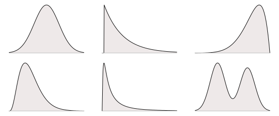
These distributions are more or less symmetric, skewed, bi-modal and short-tailed. They are also more or less commonly encountered, with the top-left symmetric heap shaped distribution being the archetypal well behaved posterior and the lower-right distribution being extremely badass bi-modal.
The Mode and Highest Density Interval
If you would represent a density plot by a point and an interval a reasonable choice would be to use the mode (the highest point) and the interval that contains the highest part of the density. Below is the mode and the highest density interval covering 95% of the probability density for the six example posteriors:
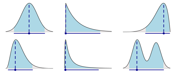
It is, of course, up to you whether you think these points and intervals represent the underlying probability densities well or not. It obviously does not work well in the bi-modal case and it might be a bit strange that the point estimate for the upper-middle distribution is pushed all the way to the left, but otherwise I think it works pretty well. For most of the densities I get a pretty good idea regarding what the underlying posterior looks like.
There is no function in base R to directly calculate these measures given a sample s representing the posterior. A quick-n-dirty function for estimating the mode can be defined by taking the maximum of a density estimate, like this:
estimate_mode <- function(s) {
  d <- density(s)
  d$x[which.max(d$y)]
}
estimate_mode(s)
The are also many functions for estimating the mode in the
modeest package, for example, the half sample mode:
library(modeest)
mlv(s, method = "HSM")
A function for estimating the highest density interval is available as part of the
coda package:
library(coda)
HPDinterval(mcmc(s), 0.95)
It is often pointed out that the mode and the highest density interval are not invariant to transformations of the x-axis, however, neither is a density plot. When viewing these summaries as graphical summaries I would consider this non-invariance a feature rather than a bug.
The Median and Quantile Interval
The median and the quantile interval have, to me, the advantage of being really easy to interpret. Both sit smack-in-the-middle of the distribution, with the median having 50% of the probability to its left and 50% to its right and the quantile interval leaving, say, 2.5% probability on either side. It’s also hard not to love medians after having read John Tukey’s Exploratory Data Analysis. Here is what these two summaries look like when applied to our six example distributions:
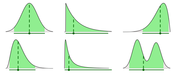
The median and quantile interval can easily be calculated using functions in base R:
median(s)
quantile(s, c(0.025, 0.975)) # for a 95% interval.
The Mean and Standard Deviation of the Posterior
The mean and the standard deviation (SD) seems to be everybody’s favorite measures of central tendency and spread. They are, however, not my favorite choice for graphical summaries of posteriors. When the distribution is skewed and fat tailed the mean can be far from the center of the density. The SD, when used to plot a symmetric interval around the mean, can misrepresent the posterior by extending out into low probability land. Below are the posterior means and SD intervals for the six example distributions. The SD intervals extend 1.96 * sd(s) out from the mean, which would result in a 95% credible interval if the posterior had been normally distributed.
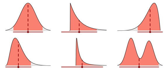
This approach doesn’t work that well in, for example, the middle-lower case as the mean is far from the center of the density plot and the SD interval extends too far to the left.
All Together Now
Let’s compare the three approaches. Below we have the mode with a highest density interval, the median with a quantile interval and the mean with an interval showing 1.96 × the SD of the posterior:
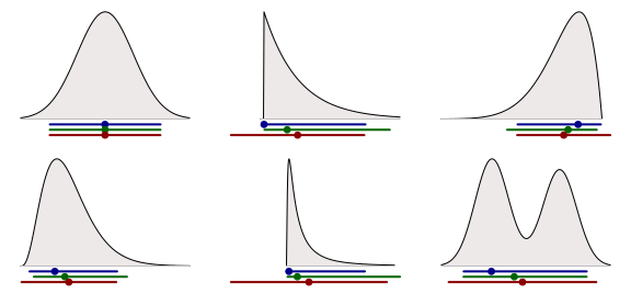
Some observations:
- In the top-left symmetrical normal case these three methods result in exactly the same point estimate and interval.
- None of the three methods does (obviously) work well in the case with the bi-modal distribution.
- The mean + SD are misleading for the skewed distributions.
Other than that it is up to you to choose which graphical summary you feel most comfortable with.
Some Final Thoughts
There is no specific reason for why the point estimates and credible intervals have to be paired as above, you can mix ’n’ match. Let’s plot the medians together with the highest density interval:

There is also nothing stopping you from plotting two, or more, intervals at the same time. The plot below shows the mode with both 95% and 50% highest density intervals.
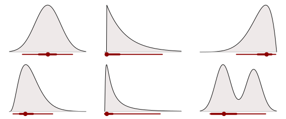
Functions to create plots like these, with two credible intervals with different coverage, are implemented in the
mcmcplots package and in the
ggmcmc package.
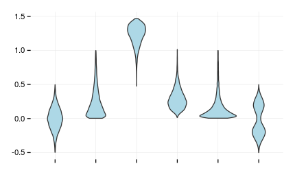
Another option, if you want to visualize many posteriors at the same time, is to use a more compact density plot such as the violin plot (here using the implementation available in
ggplot2):
